Entrepreneur and Business Resources
Integral Methods and Technology
Governance and Investor Responsibility
|
Bargain Hunter (or, It offers me protection)
By James Montier, Dresdner Kleinwort Benson
Regular readers will know that I am an unabashed value
investor. I like to buy cheap stocks. If you don't share this viewpoint,
or aren't open to be persuaded of the merits of such an approach, stop
reading now for what follows will only distress you. I am also an empiricist
at heart. Theories are all well and good, but sadly almost anything is
possible in theory. The only way to resolve theoretical impasses is to
examine the evidence. I am fond of quoting the words of Conan Doyle's
Sherlock Holmes "It is a capital mistake to theorize before one has data.
Insensibly one begins to twist facts to suit theories, instead of theories
to suit facts" or "The temptation to form premature theories based upon
insufficient data is the bane of our profession".
So is there an empirical basis to my obsession with value? The short answer
is yes. The long answer takes up the rest of this note. My usual accomplice
and compatriot in adventures involving large amounts of data is Rui Antunes,
of our global quantitative team. It was with Rui's able help, that I embarked
upon an investigation of value strategies.
The methodology
We chose the MSCI indices as our universe. The stocks were ranked first
by trailing PE and then by actual reported earnings growth over the next
12 months (as if we could perfectly predict the future). Each sort resulted
in the formation of quintiles (with 20% of the universe in each quintile).
Given we sorted on two variables, we ended up with 25 portfolios of various
combinations of PEs and delivered earnings growth. The performance of
these portfolios was then tracked over the next 12 months. A sample of
our results can be seen in the table below.
In this particular case, we are examining the global market and measuring
total returns1
relative to the average of the stocks in our universe. The tables
for each of the regions we examined are provided in full at the end of
this note for reference. Portfolio (5,5) represents the cheapest of the
value stocks with the lowest achieved earnings growth. Portfolio (1,1)
is the most expensive stocks with the highest delivered earnings growth.
Portfolio (1,5) is the cheapest basket of stocks with the highest earnings
growth and so forth2.

Does value work?
Several findings are apparent from examining the table. First (and of
foremost importance to me) is that buying cheap stocks did indeed outperform.
Simply buying an equal weighted basket (assuming equal distribution of
stocks across portfolios) of the lowest 20% of PEs within the MSCI World
index generated significant outperformance (9.7% p.a. on average). Such
a strategy would have only resulted in absolute losses in only five out
of the thirty years in our sample.
However such analysis ignores the fact that firms are not equally distributed
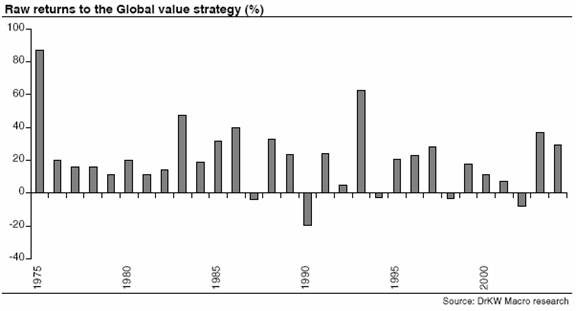
across all portfolios. The chart below shows the returns to a low PE strategy
in which the returns have been weighted by the actual distribution of
earnings in each of the categories. The results of the previous analysis
hold. The annual average raw return from a strategy of buying the lowest
20% of the MSCI World index ranked by PE was 20%. This represents a low
PE stock outperformance of the market of nearly 6% p.a!
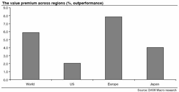
Similar patterns were found when we examined the regional breakdowns.
The chart below shows the outperformance of buying the bottom 20% by trailing
PE in the various markets we examined. There is a strongly consistent
value premium across countries/regions.
The anatomy of value
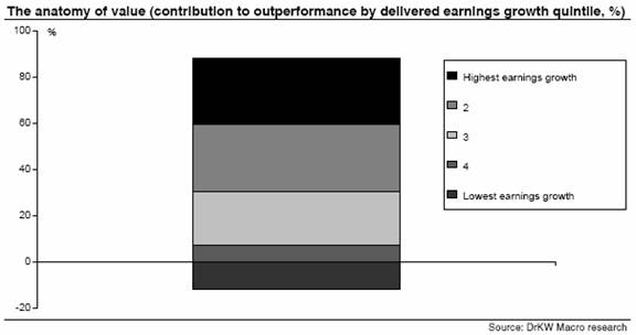
It is also noteworthy that only one of the value
portfolios resulted in underperformance (portfolio (5,5)). The table below
shows the distribution of firms across the portfolios. At the global level,
31% of the bottom 20% of the MSCI World index end up in the portfolio
that generates value underperformance. 6.2% of all stocks ended up in
portfolio (5,5), since by design the low PE stocks (portfolios (x,5) are
20% of the universe, we end up with 31% of the value universe in the underperforming
portfolio. So the majority of value stocks outperform.

The table below shows the results for all the regions. None of the value
portfolios generate a negative absolute return (supporting our hypothesis
that value offers protection). However, in general, around 30-35% of the
lowest PE stocks seem to generate underperformance. The most extreme case
is the US where the value premium comes from a minority of stocks3.
This distribution suggests that value investing can be improved by
avoiding losers.
If the underperforming 30% could be identified ex ante then the returns
to value investing could be further enhanced. In previous work, we have
highlighted the findings of Piotroski (op cit), who uses a simple accounting
screen on financial stability to help avoid the value traps. An alternative
to this might be to use some measure of quality as our quant team has
developed in a series of notes.

The siren of growth
If you had perfect foresight and knew exactly what earnings growth
would be achieved, and you bought the highest growth stocks regardless
of valuation, you would have outperformed by 11.3% p.a on average.
It is perhaps the hope or belief that investors can identify such equities
that sucks investors into growth investing, like sailors to the calls
of the sirens. However, the two most common behavioural biases are over-optimism
and over- confidence. We are all massively too sure about our ability
to predict the future.
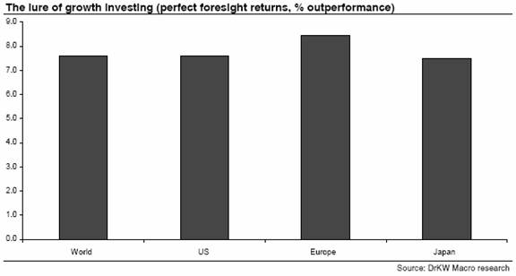
The chart below shows the distribution weighted average returns if you
had had perfect foresight across the markets. This weighting drops the
return from 11.3% to a still very healthy 7.6% p.a. The eternal hope of
growth investing is clear. If only the winners could be picked ex ante!
Combine this hope of major outperformance with the mental vulnerability
to stories that we have outlined before and the lure of growth is obvious
for all to see.
Growth doesn't mean ignoring valuation
The near monotonically declining performance of the delivered high growth
portfolios (column 1 in the table on page 2) should also be noted. That
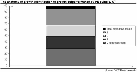
is to say growth investors shouldn't ignore value. The cheaper the
stocks they buy, the better the performance achieved. Indeed the two
lowest PE bands provide over 50% of the total outperformance of the perfect
foresight growth premium.
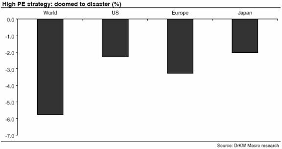
All too often, growth-investing amounts to little more than buying
highly valued equities. The table above reveals that buying the
high PE stocks would have resulted in significant underperformance.
It is also interesting to note that to generate any outperformance from
buying high PE stocks would require you to pick those stocks that delivered
the very highest growth rates (Portfolio 5,1). Even if you could do this,
you would only manage to beat the very worst of the value stock baskets.
That is to say portfolio (1,1) only manages to beat portfolio (5,5). It
fails to beat all the other value portfolios (x,5).
The distribution table on page 3 also shows that within the high PE universe
only 37% of the stocks fall into portfolio (1,5). So growth stock investing
as proxied by buying expensive stocks is all about picking a minority
of winners.
It is also worth noting that buying highly valued stocks also carries
an enormous ‘torpedo' risk. The worst returns were seen in the high
PE stocks with the lowest delivered earnings growth (underperforming by
11.9% p.a. on average!).
The disappointing reality of growth
Of course, the natural response to these findings is to ask if we can
forecast growth. We decided to investigate exactly that. We were forced
to reduce the time span of our sample because of the lack of analysts'
forecasts going back. However, we were able to start this work in 1988,
giving us 17 years worth of data.
Once again, two-way sorts into quintiles were conducted. This time we
replaced the PE with the forecast growth rate from analysts. So, we are
comparing the forecast of earnings growth with the outturn. And then tracking
the returns delivered by each of the portfolios.
The table below shows the global summary of this analysis. Just to be
clear, portfolio (1,5) is the portfolio that contains the stocks with
the highest actual earnings growth but that were expected to have the
lowest earnings growth, and so forth.
Unsurprisingly, the best stocks were the ones that had the lowest expectations
but delivered the highest outcome (portfolio 1,5), outperforming by nearly
11% p.a. The worst were those with the highest expectations and the lowest
outturns (portfolio 5,1), underperforming by nearly 12% p.a on average.

Neither of these findings is likely to shock anyone. However, the table
also shows the difficulty of picking growth stocks ex ante. If you
had invested an equal amount into the 20% of stocks with the highest
forecast earnings growth then you would have underperformed by 2.5% p.a.
on average!
In contrast, if you had invested in the 20% of stocks with the lowest
growth expectations then you would have outperformed by 4% p.a. on average.
The role of expectations in this process couldn't be much clearer.
It is far easier to surprise on the upside if the expectations are
low in the first place.
Analyst accuracy?
Of course, using these simple averages assumes an equal distribution of
stocks within each portfolio. That is akin to saying that analysts are
completely useless at forecasting the earnings growth. That strikes even
me as slightly harsh (and I am certainly not known as an apologist for
analysts as those who have seen one of my behavioural finance presentations
can attest).
But, we can also use our data to get some insight into the forecast accuracy
of analysts. The table below shows the distribution of forecasts and outturns
for the MSCI World index. Effectively the diagonals represent the points
where analysts were correct. The good news for analysts is that the majority
of forecasts are in the same quintile as the outturn. For instance, there
is a 75% overlap between those firms that analysts forecast to have the
highest earnings growth, and those that actually do have the highest earnings
growth.

Sounds impressive doesn't it? But it still means that one in four of their
forecasts is off the mark. More importantly, the table on page 4 shows
that the outperformance generated by those firms with high expected and
delivered growth is relatively small at 2.6% p.a. Whereas the 25% of firms
the analysts say are going to have the highest earnings growth, but don't
deliver have an average return of -3.7% p.a. The combined effect is that
the weighted average return on the high growth forecast portfolio is
an outperformance of 0.9%.
What about the low growth realm? There is a 70% overlap between those
firms that the analysts think will have the lowest earnings growth, and
those that do indeed have the lowest earnings growth. Indeed if we weight
the returns by the distribution accuracy of analysts, those with low
forecasts generate an outperformance of 0.9%. This is not statistically
different from the high growth result. So effectively analyst forecasts
can't tell us very much at all! They certainly can't help us identify
growth stocks as a source of significant outperformance.
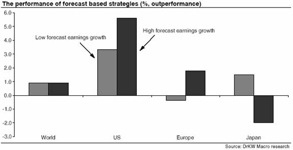
The chart below shows the regional breakdowns of the weighted performance
of forecast growth portfolios. In Japan you could have made money by shorting
the stocks with high forecast earnings growth! Elsewhere, following the
forecasts of analysts would have generated positive returns on average.
An alternative way to evaluate the power of following the forecasts is
to ask how much the forecast strategy would have managed to capture of
the idealised strategy of knowing exactly what growth was actually going
to be delivered. The table below shows the percentage of the maximum attainable
return that was actually achieved if one had bought the 20% of stocks
with the highest growth forecasts from analysts.

With the exception of the US, the results are sobering. At the global
level, following the analysts' forecasts of growth would have captured
just 24% of the total growth premium available. In Europe this improves
to 40%, still not an impressive performance. In Japan, the forecasts are
actually a better contrarian indicator than having any value in their
own right! In the US, the strategy of following the analysts did much
better, delivering 70% of the total possible return to the perfect foresight
premium.
Value vs. Growth
So to the crucial question...value or growth? The chart below shows the
weighted total return outperformance figures for the value and growth
forecast strategies for the regions since 1988.
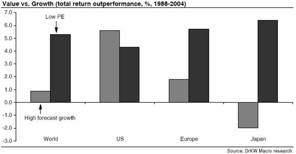
In general the results show the massive superiority of being a ‘bargain
hunter'. Ben Graham's concept of a margin of safety is still sound today.
Buying cheap stocks offers significant protection against any potential
bad news.
Only in the US does the return on following the analyst's growth forecasts
exceed the return from buying cheap stocks. However, the chart below shows
the time path of the two portfolios. The impact of the bubble years becomes
immediately obvious.
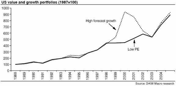
The US value and growth portfolios have actually generated very similar
returns. The value portfolio has a CAGR of 13.7%, and the high forecast
growth portfolio has a CAGR of 14.0% since 1988. Effectively there has
been little to choose between the two strategies. Although it should be
noted that the value portfolio has a markedly lower standard deviation
of returns (17.7% for the value portfolio, against 25.1% from the growth
portfolio). Thus on a risk adjusted measure value would have significantly
outperformed growth. So much for value stocks being riskier!
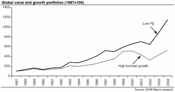
The chart below shows the portfolio returns from the global portfolios,
the performance of the low PE portfolio alongside the high forecast earnings
growth portfolio. The high forecast earnings growth portfolio earns a
10.2% CAGR p.a., whilst the low PE portfolio generates a 15.4% CAGR p.a.
1 The analysis was done in terms of both price and total returns. The results were invariant to the specification used.
2 The portfolio labels always go across the table (columns) and then down the rows.
3 Consistent with the findings of Piotroski (2000) Value Investing: The use of historical financial information to separate winners and losers, The Journal of Accounting Research, Vol 38